
Most people get Japandi colour wrong before they open a single tin of paint. They pick a greige that pulls too pink, or a white that reads too stark, and the whole room loses its quiet authority.
The problem is rarely the furniture or the layout. It is almost always the undertone. This guide covers ten Japandi living room colour schemes that working designers return to repeatedly — with exact undertone logic and paint code ranges so you can get it right the first time.
How to Read a Japandi Color Scheme Before You Pick Paint
Japandi sits between two distinct palette traditions. Japanese interiors favour warm, earthy neutrals — rice paper whites, clay tones, ink blacks, and moss greens with grey in them. Scandinavian interiors lean cooler — ash greys, fog whites, and pale birch tones.
A true Japandi colour scheme holds both impulses at once — one tone leans warm, one leans cool, and neither shouts. Understanding that tension is the key to reading any chip correctly.
Saturation is the other factor. Both traditions avoid bright colour. Every tone in a Japandi scheme should look as though it has been slightly diluted — muted, soft, and never vivid.
For a full breakdown of how colour fits into the wider Japandi interior approach, read The Ultimate Japandi Living Room Guide: Everything You Need to Know.
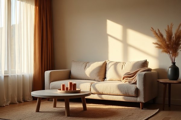
Japandi Living Room Color Scheme 1: Shiro White and Warm Birch

Shiro is the Japanese word for white. In paint terms, it refers to a white with a faint yellow or parchment undertone — not cream, but not stark. Paired with a warm birch beige (think LRV 65–75, with a yellow-to-ochre base), this scheme is the most common entry point for Japandi rooms.
Paint code range to look at: Farrow & Ball's "All White" (No. 2005) on walls, with "String" (No. 8) or "Matchstick" (No. 2013) on any joinery or panel detail.
The warmth ratio matters — the birch tone should occupy no more than 30% of the total wall surface to avoid the room reading like a Scandinavian pine cabin.
The Undertone That Stops This Palette Feeling Clinical
A white with a blue or grey undertone will read cold next to birch beige. The birch then looks dirty rather than warm. You want a white that sits in the yellow-to-neutral zone on a paint strip — not the top of the strip, but one or two steps down from pure white.
Hold the chip against a sheet of plain A4 paper in daylight. If the white looks yellow next to the paper, it has enough warmth. If it looks identical to the paper, it is too neutral for this pairing.
Japandi Living Room Color Scheme 2: Sumi Charcoal and Undyed Flax

Sumi is the deep black-grey of Japanese ink. In paint, this translates to a dark charcoal with a warm brown or green base — never a blue-black. Paired with undyed flax (an unbleached linen tone, LRV 70–78, with a yellow-brown base), this scheme is grounded and serious without feeling heavy.
Look at Farrow & Ball "Railings" (No. 31) or Little Greene "Chimney Sweep" for the dark anchor. For the flax tone, Benjamin Moore "Pale Straw" or Farrow & Ball "Hay" (No. 37) sit in the right range.
The flax tone carries the warmth the entire scheme depends on — if it reads cool or greyed-out on the wall, the room will feel industrial rather than considered.
Why the Flax Tone Must Read Warm Not Grey Against Charcoal
Dark tones pull the undertone out of adjacent neutrals. A flax that looks warm on a small chip can read greyer when surrounded by charcoal. Always test flax tones on an A3-sized patch directly next to your charcoal sample.
The flax should still read yellow-warm against the dark tone. If it greys out, move one step warmer on the paint strip before committing.
Japandi Living Room Color Scheme 3: Pale Sage and Ash Grey

This pairing draws on the Japanese moss palette — the muted, grey-green of aged stone gardens — and balances it with a cool Nordic ash grey. The sage should sit in the LRV 55–68 range, visibly green but never saturated. The ash grey should be cool-toned and light, around LRV 72–80.
Paint references: Farrow & Ball "Mizzle" (No. 266) or Little Greene "Sage" for the green, and Farrow & Ball "Moles Breath" (No. 276) lightened slightly, or "Purbeck Stone" (No. 275) for the grey.
Neither tone should be the loudest thing in the room — the palette works because both colours are equally quiet.
The 80-20 Ratio Rule That Keeps Sage from Overpowering the Room
Sage should cover approximately 20% of the colour surface. That means one wall, a recessed alcove, or a ceiling only. The remaining 80% should be ash grey or the closest neutral you are using.
When sage spreads across all four walls, it stops reading as a considered accent. It becomes the whole room's mood, and that tips the balance away from Japandi restraint.
Price history tracked · tap to check current price on Amazon
 ✦ All-time low
 Mini Paint Roller Kit
Price history · 16 weeks
 ↑ Price rising
 Paint Roller Kit-19 pcs
↑ At peak — price may drop
Price history · 16 weeks
 ↑ Price rising
 Flat Sheen (Sage Green), 1 Gallon
↑ At peak — price may drop
Price history · 16 weeks
Japandi Living Room Color Scheme 4: Clay Blush and Warm Stone

This scheme uses a terracotta-leaning blush — not millennial pink — alongside a warm stone beige. The blush must have a clear orange-red bias. LRV around 68–74, with a base that reads brown-pink rather than pink-white. The warm stone sits at LRV 70–78, neutral with a yellow-beige cast.
Farrow & Ball "Dead Salmon" (No. 28) or "Templeton Pink" (No. 303) are close references. For warm stone, look at "Oxford Stone" (No. 264) or Benjamin Moore "Muslin" (OC-12).
How to Tell Clay Blush from Pink on a Paint Chip
Take the chip outside in natural daylight — not under a warm artificial bulb, which flatters pink tones. In daylight, a true clay blush still reads brown-orange at its core.
If the chip looks pink in daylight, it is a pink tone not a clay tone — return to the strip and move toward the more orange-brown end.
Japandi Living Room Color Scheme 5: Washi Off-White and Slate

Washi paper is warm, soft, and slightly irregular in tone. In paint, this means an off-white with a yellow or pinkish-cream bias — not blue, not grey. Paired with a cool blue-grey slate (LRV 40–55), this scheme creates one of the most balanced contrasts in Japandi design because the warm and cool are clearly separated.
Paint references: Farrow & Ball "Pointing" (No. 2003) for the off-white. For slate, look at "Down Pipe" (No. 26) or "Plummett" (No. 272) at the lighter end.
The contrast between a warm off-white and a cool slate only works when both tones are genuinely committed to their respective temperature bias — a neutral white will flatten the whole scheme.
Matching Paint Finish to Surface When Mixing Off-White and Slate
Use matte finish on walls in both tones. This removes any sheen competition between the two colours and lets the tones do the visual work.
Reserve eggshell for joinery and skirting only — and only in the off-white tone. Slate in eggshell on a large wall surface picks up too much light reflection and loses its quiet depth.
Japandi Living Room Color Scheme 6: Indigo Wash and Pale Putty

Japanese indigo — called ai — appears throughout traditional textile and ceramic work. In a living room, it translates to a heavily desaturated blue-grey that still reads as having blue in it. LRV around 35–48, with a blue-grey base that leans cool. Pale putty (LRV 72–80, warm grey-beige) forms the ground.
Look at Farrow & Ball "Hague Blue" (No. 30) as a starting reference — but the application should be limited and, if possible, diluted by using the paint brand's tinting base at a 70% mix. For putty, "Elephant's Breath" (No. 229) at the paler end of its range is a strong match.
Why Indigo in a Japandi Scheme Must Lean Desaturated Not Navy
A full-saturation navy reads as a statement colour. Japandi does not use statement colours. The indigo tone you want should look as though it has been washed multiple times — still identifiably blue, but greyed down.
Hold the chip next to a standard navy and compare — the Japandi indigo should look significantly paler and less intense, closer to a distant shadow than a strong dye.
Japandi Living Room Color Scheme 7: Warm Mushroom and Dark Walnut Brown

Mushroom is a greige — part grey, part beige — but the warm version leans toward the beige end with a red-brown bias. LRV 55–68. Dark walnut brown here refers to a deep warm brown at LRV 18–28, similar to the wood tone of oiled walnut. This is a rich, grounded scheme.
Paint references: Farrow & Ball "Elephant's Breath" (No. 229) or "Jitney" (No. 293) for mushroom. For walnut brown, "Mahogany" (No. 36) or Little Greene "Dark Lead" give the right depth.
The Light-Source Test for Warm Mushroom Before Committing to a Tin
Mushroom tones shift significantly between north-facing and south-facing rooms. In a north-facing room, the red-brown bias recedes and mushroom can read cold grey-beige. In a south-facing room, the same tone glows warmly.
Paint an A3 sample patch and observe it at three different times — 9am, 1pm, and 6pm — before committing. The tone should hold its warmth across all three readings in the light conditions of your specific room.
Japandi Living Room Color Scheme 8: Fog White and Muted Olive

Fog white is a cool white with a faint grey undertone — barely there, but perceptible. LRV 82–90. Muted olive is a low-saturation yellow-green with a significant grey content — not khaki, not yellow-green, but a toned-down green that reads almost neutral. LRV 48–60.
Paint references: Farrow & Ball "All White" (No. 2005) for fog — or "Strong White" (No. 2001) for slightly more grey. For muted olive, "Mizzle" (No. 266) or Dulux "Fenland Moss" sit in the right territory. Designers at Architectural Digest frequently reference this tonal combination in contemporary neutral schemes.
The fog white gives the scheme its Scandinavian coolness whilst the muted olive provides the Japanese earth connection — remove either and the Japandi balance collapses.
Identifying a True Muted Olive Versus a Yellow-Green on the Strip
On a paint strip, olive sits near the middle — not at the bright yellow-green top, not at the deep khaki bottom. The tone you want should look grey-washed even on the chip.
Hold the chip against a piece of plain olive fabric or an aged stone tile. The paint tone should feel similar in saturation — quiet, not vivid. If the chip looks bright or yellow in comparison, move down the strip toward the greyer tones.
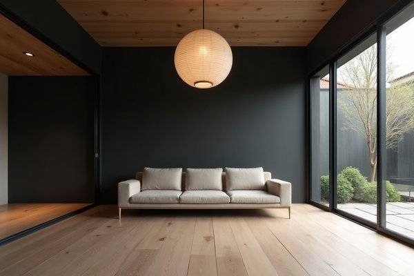
Japandi Living Room Color Scheme 9: Carbon Black and Raw Linen White

This is the highest-contrast scheme in the list. Carbon black is a very deep neutral — LRV 3–8 — that must lean brown-warm, not blue-black. Raw linen white is an off-white with a clear cream-to-warm-yellow bias, LRV 80–88. Applied to a single feature wall in carbon against three walls of linen white, this scheme reads as deliberate rather than stark.
Paint references: Farrow & Ball "Pitch Black" (No. 256) for carbon — check in natural light to confirm the brown bias. For raw linen white, "Pointing" (No. 2003) or "Lime White" (No. 1) hold the warmth this scheme requires.
How to Stop a Carbon and White Scheme Reading Stark or Graphic
A carbon black with blue in it reads graphic and cold — more New York loft than Japandi living room. The warm-brown bias in the carbon is what gives it the wabi-sabi quality. Test the black chip next to a pure blue-black sample and choose the one that looks softer.
The linen white must also lean cream — if it pulls cool or grey, the contrast between the two tones becomes harsh rather than considered.
Japandi Living Room Color Scheme 10: Driftwood Taupe and Soft Chalk

This is the most tonal scheme in the list. Driftwood taupe sits at LRV 58–68 — a warm-cool grey-brown that reads almost like a dried piece of coastal timber. Soft chalk sits at LRV 80–88 — a barely-there warm white. The two tones sit close together. The scheme is deliberate in its subtlety.
Paint references: Farrow & Ball "Hardwick White" (No. 5) or "Cornforth White" (No. 228) for the taupe. For soft chalk, "Dimity" (No. 2008) or "Slipper Satin" (No. 2004) carry the right warmth.
Using Sheen Variation Instead of Color Contrast in a Tonal Scheme
When two tones are closely matched in LRV, sheen difference carries the visual work. Apply the taupe in flat matte. Apply the chalk in eggshell on all joinery, skirting, and any panelling.
The matte absorbs light and pushes the taupe tone back, whilst the eggshell on the chalk reflects light forward — this separation creates depth without introducing additional colour.
Japandi Color Scheme Mistakes That Show Up in the Paint Stage
The most common mistake is using a cool white. Blue-white or grey-white tones sit outside the Japandi warmth spectrum. They read clinical against wood tones and flatten every natural material in the room.
The second mistake is using an oversaturated accent. Any tone that reads vivid on a chip — bright blue, strong green, saturated red — will dominate a Japandi room. Every colour in the scheme should look as though it has been slightly thinned.
Mismatched trim is the third and least-discussed mistake — bright white gloss skirting boards underneath a warm matte wall break the undertone consistency immediately. Always paint trim in a version of your wall white, never in a standard trade white.
Frequently Asked Questions
What colours work best in a Japandi living room?
The best Japandi living room colours are warm neutrals, desaturated earth tones, and muted greens or blues. Think rice-paper whites, undyed linen beiges, charcoal with brown bias, and pale sage. Avoid bright, saturated tones — every colour should read slightly muted or diluted.
What is the difference between Japandi colours and Scandinavian colours?
Scandinavian palettes lean cool — grey-whites, ash tones, and icy blues. Japandi palettes add warmth from the Japanese side — clay tones, warm ink blacks, and earthy greens. A true Japandi scheme holds both a warm and a cool tone at the same time rather than leaning fully into one tradition.
Can you use black in a Japandi living room colour scheme?
Yes — but the black must lean warm. A blue-black reads too graphic and cold. Look for a carbon or ink black with a brown or green undertone. Limit it to one surface, such as a single wall or a ceiling, and balance it with a warm off-white or linen tone on the remaining surfaces.
Getting Japandi colour right comes down to undertone discipline and saturation restraint. Both elements are readable on a paint chip once you know what to look for.
Comments