
The ocean isn't one colour. It's thirty. A blue coastal bedroom works the same way — moving from near-black navy at the deep end to barely-there ice blue at the shore.
Most coastal bedrooms lean on sandy neutrals and let blue play second fiddle. These rooms don't. Blue is the dominant palette here, across every tone, texture, and shade.
Deep End: Blue Coastal Bedrooms That Go Dark and Moody

Dark blue coastal rooms feel grounded rather than heavy. The key is pairing deep blues with pale, natural surfaces that bounce light back into the space.
These aren't dramatic rooms. They're calm, deliberate, and quiet in a way that only deep colour can achieve.
Navy Shiplap Walls With Bleached Oak Flooring

Navy shiplap walls work because the horizontal groove lines break up the colour mass. The texture stops the room feeling flat or oppressive.
Pair the walls with bleached oak floors in a matte finish — around $6–$12 per square foot for engineered boards. The pale wood pulls light down from the walls and into the floor plane.
Keep bedding white or off-white. The contrast between navy and bleached oak does all the work.
Indigo Linen Headboard Against a White Plaster Wall

A deep indigo upholstered headboard becomes the room's anchor without competing with anything. Set it against a bare white plaster wall — no art, no sconces.
Linen upholstery in the $300–$600 range gives the headboard a soft, lived-in surface. Indigo reads as blue-purple in low light and pure blue in daylight.
That shift keeps the room feeling dynamic without adding a second colour.
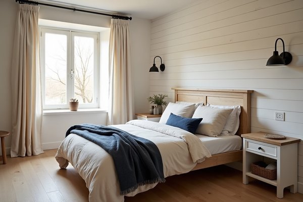
Dark Denim Blue Ceiling With White-Washed Walls Below

Painting the ceiling denim blue and leaving the walls white-washed creates an inverted colour relationship. Most rooms put dark on the walls and light overhead — reversing this feels unexpected.
The result is cosy without being enclosed. The eye goes up, not inward.
Use a matte ceiling paint in a dark denim tone — Benjamin Moore's "Newburyport Blue" is a reliable reference point. Walls in white or pale grey keep the lower half of the room open.
Mid-Blue Coastal Bedrooms: Where Cornflower and Slate Take Over

Mid-range blues are the most flexible shades in any blue coastal bedroom. They sit between moody and airy — versatile enough to work in north-facing rooms and south-facing ones alike.
This range rewards natural materials. Rattan, raw linen, and whitewashed wood all sit well against cornflower and slate blue.
Cornflower Blue Bedding on a Raw Linen Duvet

Cornflower blue bedding introduced through pillow covers and a duvet insert cover gives the room its focal point. Use it over a raw, undyed linen duvet cover as the base layer.
The contrast between the dyed cornflower tone and the natural linen below gives depth without pattern. Look at cotton-linen blend covers in the $60–$140 range — they hold colour well and soften with washing.
This is a low-commitment way to bring mid-blue into the room.
Slate Blue Limewash Walls With Rattan Bed Frame

Limewash paint in slate blue creates a mottled, faded surface that reads differently at every hour of the day. It looks like the wall has been sun-bleached over decades.
Pair it with a rattan bed frame — natural, unwrapped rattan in the $400–$900 range works best. The organic texture of the rattan balances the cool, mineral quality of the limewash.
Together, the two materials feel genuinely beachy without any clichéd decoration. For broader coastal bedroom ideas, this pairing appears again and again in well-executed beach house rooms.
Dusty Blue Panelled Wainscoting From Floor to Bed Height

Dusty blue wainscoting painted from the skirting board to roughly 90cm up the wall is an architectural move, not a decorating one. It gives the room structure.
Paint the panels in a muted, grey-blue tone — something in the dusty or chalky register. Leave the wall above it white or very pale grey.
The break between the two tones draws the eye to bed height, which frames the room around the bed naturally.
Price history tracked · tap to check current price on Amazon
 ✦ All-time low
 Navy Blue Queen Comforter Set
Price history · 16 weeks
 ✦ Editor's pick
 7 Pieces Bed in a Bag Navy Blue Floral Comforter and Sheet Set
Price history · 16 weeks
 ✦ All-time low
 Bedspread Comforter - 3 Pieces
Price history · 16 weeks
Steely Blue Velvet Throw Over a White Waffle Coverlet

A steely blue velvet throw folded across the foot of the bed introduces texture without adding another colour. Lay it over a white waffle-weave coverlet.
The contrast between the waffle's textured cotton surface and the flat sheen of velvet is what makes this work. Look for throws around 130cm × 170cm in a steel or slate blue velvet — roughly $50–$100.
The waffle coverlet stays white or off-white. This is a two-material room, not a two-colour one.
Pale and Airy: Sky Blue and Powder Blue Coastal Bedrooms

The lightest end of the blue spectrum works in rooms with generous natural light. Design authorities like House Beautiful consistently highlight pale blue as one of the most liveable bedroom colours for exactly this reason — it recedes, opens, and calms.
Pale blue rooms need restraint. The less you add, the more the colour does.
Sky Blue Ceiling in an All-White Bedroom

Painting just the ceiling sky blue in an otherwise all-white room is the quietest move in this article. White walls, white bedding, white trim — then one pale blue overhead plane.
It reads almost subconsciously. The eye picks it up without the brain fully registering why the room feels coastal.
Use an eggshell or matte finish in a sky blue — Farrow & Ball "Lulworth Blue" is a widely available reference. The ceiling becomes the fifth wall, and the only blue surface in the room.
Powder Blue Grasscloth Wallpaper From Skirting to Crown

Powder blue grasscloth wallpaper gives a pale room depth through texture rather than pattern. The woven grass fibres cast tiny shadows across the surface.
Run it full-height — skirting board to crown moulding — for the most cohesive effect. Expect to pay $80–$150 per roll for quality grasscloth; a standard bedroom takes roughly 8–12 rolls.
The result is a room that feels soft and layered without being busy.
Icy Blue Cotton Percale Sheets With a Bleached Wood Bed

Ice blue percale sheets are the softest, most understated coastal move possible. The colour is barely there — closer to white with a blue undertone than to any saturated blue.
Pair them with a sun-bleached solid wood bed frame — look for whitewashed or natural-bleached pine or oak in the $500–$1,200 range. The pale wood and ice blue read as one quiet, cohesive surface.
This is the quietest room in the article. It works precisely because of that restraint.
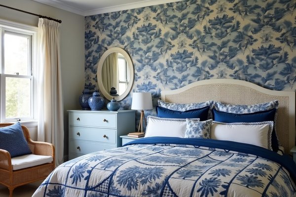
Blue on Blue: Layering Multiple Blue Tones in One Coastal Room

Tonal layering — using navy, slate, and sky in the same room — only works when the values (light and dark) are spaced far enough apart. Put two similar blues together and they fight.
Space them correctly and the room reads like a colour gradient.
Navy Pillow Covers, Slate Blue Duvet, Sky Blue Walls — One Room

This combination works because three blue tones hit three different value points — dark, mid, and light. Navy pillow covers against a slate blue duvet against sky blue walls.
Each tone is distinct enough that the eye separates them. The room reads blue without feeling monotonous.
Keep all other materials neutral — raw linen, bleached oak, white cotton. No other colour competes.
Blue Woven Rug That Graduates From Deep to Pale Across the Floor

A gradient blue woven rug anchors the room and does the tonal layering on its own. Look for flat-weave cotton or wool rugs that move from deep navy at one end to pale blue or white at the other.
These typically come in 160cm × 230cm or 200cm × 300cm sizes — expect $120–$350 for a mid-quality flat-weave option. The gradient effect mirrors an ocean horizon across the floor.
Position the darker end under the bed and let the paler end extend toward the door.
Blue Coastal Bedrooms With Natural Texture as the Contrast

In a room where blue dominates, natural materials do the balancing. Rattan, seagrass, jute, and weathered wood add warmth without introducing another colour.
These rooms stay strictly blue and neutral. The contrast comes entirely from texture.
Seagrass Pendant Light Against a Deep Blue Accent Wall

A woven seagrass pendant hung against a deep blue feature wall softens the wall without adding colour. The pale, warm weave of the seagrass sits against the cool blue in a simple textural contrast.
Look for drum or dome-shaped seagrass pendants in the $60–$180 range. Keep the other walls white or pale to concentrate the contrast on the accent wall.
The pendant reads as a warm tone without technically adding one.
Weathered Teak Nightstand Beside a Blue Linen Bed

A weathered teak nightstand with a rough, unfinished surface provides textural relief next to smooth blue linen upholstery. The contrast is tactile, not colour-based.
Teak nightstands in a naturally aged finish run $150–$400 for solid wood pieces. Look for ones with visible grain and a dry, matte surface — not oiled or lacquered.
The blue linen bed frame and the rough teak nightstand become a textural conversation.
Woven Jute Wall Hanging as the Only Warm Note in a Blue Room

A large jute wall hanging — roughly 60cm × 120cm — provides warmth and texture in an otherwise cool blue room. It's the single concession to warmth in the whole space.
Choose a simple woven or macramé piece without dyed colour — natural undyed jute only. Expect to pay $40–$90 for a handmade piece in that size.
Position it above the bed or beside the window. One piece is enough.
Frequently Asked Questions
What shades of blue work best in a coastal bedroom? Navy, slate blue, cornflower, and sky blue all work in a coastal bedroom. The best choice depends on how much natural light the room gets — darker shades suit brighter rooms, paler shades suit north-facing spaces.
Can you use multiple shades of blue in one bedroom without it looking too much? Yes, but only if the tones are spaced far enough apart in value — meaning one dark, one mid, one light. Placing two similar blues together looks unintentional. Spacing them correctly creates a cohesive, layered effect.
What materials balance a blue-dominant coastal bedroom? Raw linen, rattan, bleached oak, seagrass, jute, and weathered teak all balance blue without adding another colour. They introduce warmth and texture, which is all a blue room needs.
A blue coastal bedroom doesn't need to reference the sea directly. The colour does that work on its own.
Comments